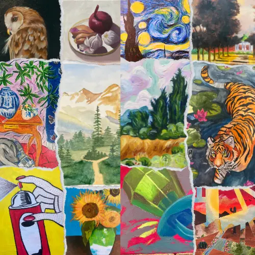
Why Color Theory in Painting Matters More Than You Think
Have you ever looked at a painting and felt something you couldn’t explain—like warmth, excitement, or calm? Chances are, color was the reason. Understanding Color Theory in Painting isn’t just for advanced artists or people who remember the color wheel from grade school. It’s one of the most powerful tools any artist—especially beginners—can have in their creative toolkit.
At The Artist Outpost in sunny Ocean Beach, San Diego, we believe color isn’t just about what you see—it’s about what you feel. Whether you’re dipping your toes into the world of painting or looking to take your art to the next level, learning Color Theory in Painting can transform the way you create and connect with your artwork. Ready to see color in a whole new light? Let’s dive in.
The Basics: What Is Color Theory in Painting?
At its core, Color Theory in Painting is a framework that helps artists understand how colors interact, mix, and influence each other. It’s the science—and art—of combining colors to achieve harmony, contrast, mood, and movement within a piece.
Here’s a quick refresher on the essentials:
- Primary Colors: Red, yellow, and blue. These cannot be made by mixing other colors.
- Secondary Colors: Green, orange, and purple—made by mixing two primary colors.
- Tertiary Colors: Created by mixing a primary and a secondary color (like red-orange or blue-green).
Once you know this, you’re already on your way to mastering Color Theory in Painting—but this is just the tip of the rainbow.
Mixing Colors: More Than Just Combining Paint
Mixing colors is one of the most fun—and frustrating—parts of painting. Have you ever tried to mix a specific color and ended up with mud? You’re not alone.
Here are some golden tips:
- Start with less: Add a small amount of darker color to a lighter one, not the other way around. It’s easier to darken than to lighten.
- Know your complements: Colors opposite each other on the color wheel (like blue and orange) are called complementary colors. Mixing them creates neutrals like browns and grays—great for shadows and balance.
- Keep a mixing chart: Many students in our Painting Classes find this super helpful. Documenting your color recipes helps you recreate the exact tone later on.
Understanding how to mix strategically is at the heart of Color Theory in Painting, and with a little practice, you’ll feel more confident every time you dip your brush.
Harmony vs. Contrast: The Secret to Striking Artwork
Every painting tells a story, and the use of harmony and contrast decides how loudly it speaks. In Color Theory in Painting, these concepts are essential for visual interest.
- Color Harmony: Using colors that are visually pleasing together (like analogous colors: blue, blue-green, and green) creates a calm, cohesive feel.
- Color Contrast: Pairing opposites (like red and green) creates drama and energy. It’s great for emphasizing focal points.
A good painting usually has a mix of both—balance the calm with the bold, and your work will stand out every time.
💡 Pro Tip: Our beginners love experimenting with both strategies in our “Expressive Painting” workshop. You can also explore more beginner-friendly tips in our article 7 Must-Know Secrets to Master Painting for Beginners (Even If You’ve Never Picked Up a Brush!).
Warm vs. Cool Colors: Set the Mood with Every Stroke
Color isn’t just visual—it’s emotional.
- Warm Colors (reds, oranges, yellows): Energizing, bold, and attention-grabbing. Use these to bring life and light to your work.
- Cool Colors (blues, greens, purples): Calm, serene, and often used to create distance or depth.
Understanding Color Theory in Painting means learning how to tap into these emotional cues. Want your painting to feel cozy and welcoming? Lean into warm tones. Looking to create a peaceful landscape? Cool tones might be your new best friend.
And if watercolor is your medium of choice, check out our guide on 11 Watercolor Techniques Every Artist Should Know (Even If You’re Just Starting!) for color blending tips that bring your palette to life.
Creating a Color Palette: Your Artistic Fingerprint
When you walk into The Artist Outpost, one of the first things we’ll help you develop is your personal palette. This is where Color Theory in Painting really becomes your own.
Here’s how to create one:
- Choose a dominant color that sets the tone for your piece.
- Add supporting colors that harmonize or contrast in a meaningful way.
- Don’t forget neutrals (black, white, gray, beige) to create balance.
Whether you’re working in oils, acrylics, or watercolors, your palette is the visual voice of your painting. It reflects your mood, your message, and your style.
Real-World Applications: Why Every Artist Should Study Color Theory in Painting
Still wondering why it matters?
- A 2022 study published in Psychology of Aesthetics, Creativity, and the Arts found that color use significantly influenced how viewers rated artwork in terms of emotional depth and aesthetic appeal.
- Professional artists and illustrators often credit Color Theory in Painting as the foundation of their careers—not just in fine art, but also in design, fashion, and film.
And here at The Artist Outpost, we see the impact every day. Students who grasp color theory progress faster, enjoy their work more, and feel more empowered in every class.
FAQs About Color Theory in Painting
What is the difference between hue, value, and saturation?
- Hue: The name of a color (red, blue, yellow).
- Value: How light or dark the color is.
- Saturation: How intense or pure the color is.
Why do my mixed colors look dull?
Chances are you’re mixing complementary colors without enough control. Try using a palette knife and keeping your colors cleaner as you blend.
How do I know which colors go well together?
Study the color wheel, explore analogous and complementary schemes, and test what feels right. There are no “rules,” just tools.
Can color theory be used in abstract art?
Absolutely! Abstract artists often rely heavily on Color Theory in Painting to evoke emotion and guide the viewer’s experience.
Your Journey with Color Starts Now
Color is more than paint on a canvas—it’s the emotional heartbeat of your art. By understanding Color Theory in Painting, you’re opening the door to deeper expression, stronger compositions, and more meaningful creative experiences.
Whether you’re creating your first painting or refining your signature style, color theory is your companion in every brushstroke. And we’re here to help you explore it.
👉 Curious to try it for yourself? Join one of our hands-on Painting Classes in Ocean Beach and let’s turn your ideas into colorful reality. We’ll guide you through color mixing, harmony, contrast, and everything in between—no experience needed.
The canvas is waiting. Let’s make it come alive.